Author – Nimai Ahluwalia, Cloud Engineer
Power BI is a suite of business analytics tools to analyze data and share insights. Monitor your business and get answers quickly with rich dashboards available on every device.
Power BI comes up with great and some amazing features every month which is making it more effective and powerful tool down the line.
We will understand some great features of Power BI in this blog which will help us to visualize and model the data more efficiently.
This Blog will be covering features like:
- Gradient Legend.
- Relative Data Slicer.
- Q&A Feature.
- Hierarchical slicer
- Azure Map Visual
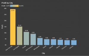
- Top 10 City’s conditionally formatted by Profit with Gradient Legend Feature.
We can filter the Visual depending upon the Top N and Bottom N Category in context with any data when filtering.
At the same time, we can apply conditional formatting to the visual.
Previously Power BI didn’t have this capability of describing the conditional formatting which was very difficult for the user to understand the idea of it.
Gradient Legend Feature helps to understand the colour format from Low to High in the Legend to make the user understand which colour is indicating the increase and decrease in the data.
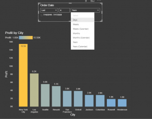
- Advance Relative Date filter
Relative date slicer can be integrated with page, visual and report level.
With emerging fast refresh scenarios, the ability to filter to a small window of time and date can be useful.
When you apply a relative date filter or slicer at the page or report level, all visuals on that page or report are filtered to the exact same time range and date range.
If we understand this feature logically, we can conclude that it has almost eliminated the use of Time Intelligence functions which we used to travel back in time.
- Asking Questions to your Data using Everyday Language Now!
The Q&A visual can be both used as a tool to allow consumers to quickly get answers to their data using natural language. As it behaves like any other visual.
We can train our Q&A model with specifying questions in it so that we get faster results.
It consists of 4 core components
- The question box. This is where the user types the question.
- A pre-populated list of suggested questions.
- Icon to convert the Q&A visual to a standard Visual.
- Icon to open Q&A tooling which allows configuring the natural language engine.
- Hierarchical slicer
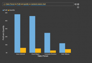
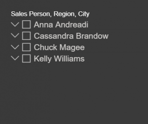
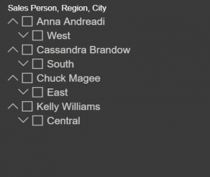
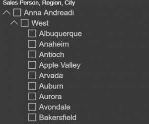
The hierarchical slicer is a very user-friendly slicer which is used to demonstrate hierarchy scenarios in the organization with various other features including like editing the slicer header, select all or none option and much more.
Previously we didn’t have a General Availability Hierarchical slicer we had to use custom visual for that which was not much efficient while using it in Power BI Service and Desktop.
-
-
-
-
-
-
-
-
-
- Sales Person –
-
-
-
-
-
-
-
-
-
-
-
-
-
-
-
-
-
- Sales Person – Region
-
-
-
-
-
-
-
-
-
-
-
-
-
-
-
-
-
- Sales Person – Region – City
-
-
-
-
-
-
-
-
- Azure Map Visual (preview)
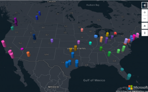
The Azure Maps visual for Power BI leverages built-in features like tooltips, colour themes, as well as filter and slicer support.
The eye-catching difference between the other map visuals and the Azure Map visual is that we can improve the quality of the location by clicking on the bottom right corner on the improve the map icon.
As this feature is in preview and hence may not work in the way which we need.
There are 5 visualization layers:
- Bubble layer
- 3D bar chart layer
- Reference layer
- Custom Layer
- Real-time traffic overlay
3D bar chart:
3D bar charts are useful for taking data to the next dimension by allowing visualization of location data as 3D bars or cylinders on the map.
In Azure Map Visual we can be tilt and rotate the map by holding down the right mouse button.
We can visualize two data metrics at the same time using colour and height.
Real-time traffic overlay:
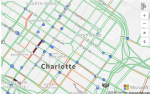
This is a very effective map visual where we can track the live status of the traffic and relate with our data if necessary.
Real-time traffic is overlaid on the map and provides a quick visual reference of which technicians (Blue bubble) are most likely to be delayed getting to their next job due to traffic congestion.
Bubble Layer:
Bubble layers are a great way to represent location data as scaled circles on the map.
Allowing the user to easily visualize two metrics for each location on the map, scale and category.
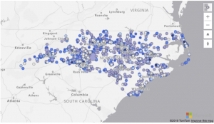
For example, the following image shows bicycle accident locations in North Carolina. The colour indicates the speed limit of the road the accident occurred on and the size is based on the number of individuals involved in the accident.


